At the new Clifton’s cafeteria, over-the-top nostalgia is amplified and digitized

- Share via
The much-anticipated remake of Clifton’s Brookdale cafeteria on Broadway carries a stamp of approval from the leading preservation group in town, the Los Angeles Conservancy, which held a benefit there last month.
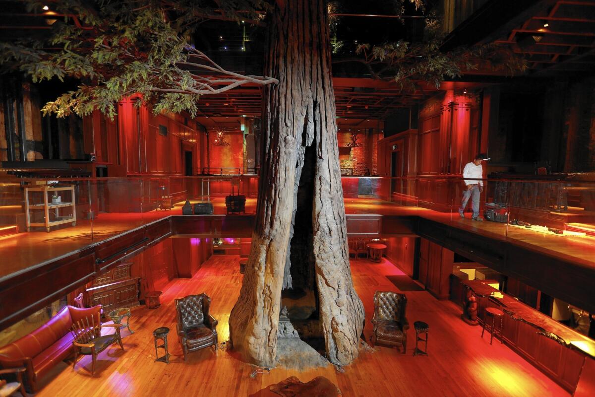
Yet the new Clifton’s is less a studious restoration of the original cafeteria, which opened in 1935 with a cheerfully campy California redwoods theme, than an aggressively nostalgic amplification of it. The place is overstuffed and over the top, which is exactly the point: a jumbled tower of new and touched-up murals, taxidermy, plush furniture, wide and well-polished bars, dioramas and display cases. Even the nooks have nooks.
The expanded restaurant has been hailed as a sign of the maturity of the downtown renaissance. It’s also come under fire as a marker of Broadway’s headlong gentrification — and as a betrayal of the charitable mission of the original. The old pay-what-you-wish policy, born of the Great Depression, will not be reinstated.
SIGN UP for the free Essential Arts & Culture newsletter >>
But there is more to the story than tension between the old Clifton’s ethos and the new waves of money sloshing down Broadway. This spiffed-up temple to idiosyncrasy also has a surprisingly layered story to tell about the relationship between architectural nostalgia and today’s digital world — especially since its target demographic probably first learned about its rebirth on a glowing screen of some kind, will arrange to meet friends there on another and may reminisce about the visit on a third.
Like the Ace Hotel down the street, where a carefully restored 1927 facade covers a wholly new interior conceived by the design firm Commune as a fashionable marriage of Viennese Secessionism and early L.A. Modern, Clifton’s is a blend of the old, the oldish and the faux-antique.
Under the direction of Andrew Meieran, the developer who paid $3.6 million for the building five years ago and has spent $10 million more transforming it into what he calls a “cabinet of curiosities” — those three words are now spelled out above the front door — new kitsch has been laid alongside well-scrubbed old kitsch.
It has also been given plenty of room to flower on its own: The section of the building open to the public spreads across five levels, with the middle dramatically hollowed out to make room for a three-story atrium dominated by a 40-foot-tall artificial redwood tree with a fireplace installed at its base.
There is now a tiki bar near the top — bartenders will serve drinks from inside a vintage Chris Craft mahogany boat — and a speak-easy in the basement. No architect is mentioned in the press release on the reopening, which says “Meieran personally curated the museum-quality, natural and scientific artifacts that punctuate every level.”
Like the Ace, the remade Clifton’s is pitched in large part to consumers born in the 1970s, ‘80s and ‘90s. This is a slice of the public that has shown a nearly bottomless taste for revivalist culture of all kinds, that orders its cappuccinos from young men in tweed vests and handlebar mustaches and listens to FKA Twigs (born 1988) on vinyl.
It’s also a public that spends an increasing share of its waking hours living not in the past or a plausible re-creation of it but in some part of the digital realm, where everything is eternally, relentlessly new.
Sentimentality and thickly layered historicism have had their appeal in virtually every era, often as an antidote to calls for aesthetic or moral restraint. This particular branch of Clifton’s opened just as Modernist architecture, Eero, which declared war on nostalgia in all its forms, was gaining a genuine foothold in American culture.
The supremely influential “Modern Architecture: International Exhibition” opened at the Museum of Modern Art in New York in 1932. The Modernists R.M. Schindler, Richard Neutra and Irving Gill were already well established in Los Angeles by the time Clifford Clinton opened the first of what would become a popular string of cafeterias, merging his first and last names to spell Clifton’s, in 1931.
Stunning photos, celebrity homes: Get the free weekly Hot Property newsletter >>
But the gulf between the kitschy and the streamlined, the cabinet of curiosities and the open plan, appears deeper now.
This seems especially true as we realize just what lengths technology companies will go to — and what profits are to be reaped — in making the online world not just streamlined but ruthlessly so.
Around the time Meieran was throwing the first reopening parties at Clifton’s, Google was introducing its new logo, which trades the collection of letters the world had grown familiar with for a new version in a sleek typeface without the ornamental typographical touches known as serifs.
Though the change was partly a re-branding exercise, Google has admitted that a major advantage of the new logo is that without those serifs it loads a few crucial milliseconds faster than before.
The switch is part of a larger shift in online graphic design that is seeing not just serifs but layering, shadows and texture of all kinds disappear because they get in the way of efficient data flow — and therefore of revenue. Mies van der Rohe, with his dictum “less is more,” and Adolf Loos, who wrote a 1908 polemic equating ornament with crime and degeneracy, have nothing on the minimalists in today’s Silicon Valley.
As a reaction to those forces, Clifton’s has an obvious countervailing charm. Its awkward corners have been carefully added or burnished, not swept away.
Look a little longer, though, and you may discover that the artfully crowded throwback interior, whether at Clifton’s or the Ace or the steampunk-themed Edison, Meieran’s first downtown venture into the profitably anachronistic, is not an antidote to digital culture but a surprisingly effective complement to it.
These seemingly opposite impulses — accumulation and efficiency, the decorated and the smooth — are in fact these days two sides of the same coin.
In the case of Clifton’s and places like it, the goal is to pile up enough campy touches and ornamental details to fill several bars on several floors, to entertain your guests for several hours or on repeat visits.
Even putting aside the practice of feeding people who couldn’t afford to pay, the old Clifton’s was horribly designed from a cash-flow point of view. There were only a couple of cash registers in the cafeteria, as I recall, and on busy lunch hours a bottleneck was known to form there.
Now there are many more places on many more levels where your credit card can be swiped (or maybe your iPhone or Apple watch quickly scanned) for digital payment. There is little danger, in other words, that the prominent weirdness of the new Clifton’s will be allowed to interfere with the transactional velocity of the place.
For Google and other technology companies that are eternally redesigning their logos and Internet personas, meanwhile, the goal is to streamline the design of the Web so much that clicks and ad pages can be stacked as high as the quirky details are stacked at Clifton’s.
In the dim, campy and retro-chic hotel or bar you collect to streamline; on the bright, always-on Web you streamline to collect. Not so much of a gulf after all.
Follow me on Twitter @HawthorneLAT
More to Read
The biggest entertainment stories
Get our big stories about Hollywood, film, television, music, arts, culture and more right in your inbox as soon as they publish.
You may occasionally receive promotional content from the Los Angeles Times.


