Opinion: Elon Musk just X’d out the sharing, caring ethos of the internet once and for all
- Share via
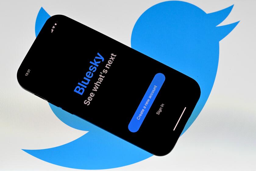
The blue bird is dead. Long live the black X.
As the Twitter birdie flew off to logo heaven this week, something else also seemed to be vanishing. A whole aesthetic.
For the record:
10:06 p.m. July 26, 2023An earlier version of this article dated the smiling Macintosh to 1980. The correct year is 1984.
The user-friendly design that has defined tech from the first smiling Macintosh in 1984, through the chirping aviary of social media in the present day, is rapidly losing ground. In its place? User-frightening design.
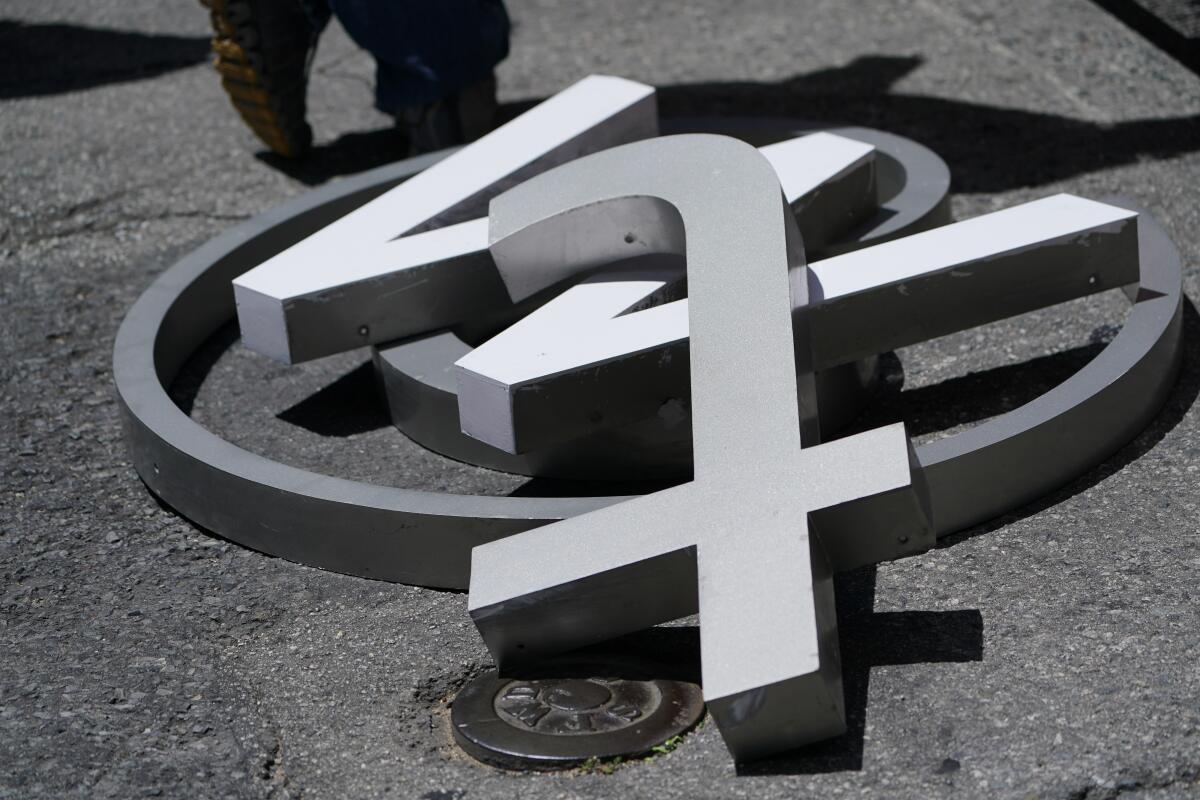
Elon Musk has unveiled a new ‘X’ logo to replace Twitter’s blue bird as he follows through with a major rebranding of the social media platform.
With amoral AI fast-tracked to take the place of social media as the internet’s killer app, perhaps we need design that serves more as a warning than a beacon. Less “come on in” and more “keep out.”
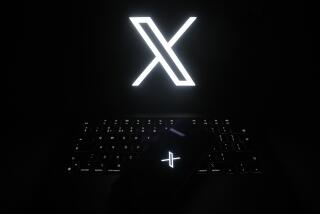
Indeed, at a glance, the black X that the company introduced as its work-in-progress logo this week recalls the skull-and-crossbones on cartoon bottles of poison.
In other words, if Twitter-turned-X is toxic, maybe it’s time it was properly labeled.
But the vibe shift didn’t start this week. We had an inkling of the friendly-to-frightening metamorphosis in 2008 when the first Tesla roadster — with its midlife-crisis styling — became the face of electric vehicles. The swaggering, outta-my-way design stole the category from the prudently shaped Prius family hybrid.
Or maybe user-frightening design started to win in the 2010s, when Lyft, sporting cute Barbie-colored mustaches on car grilles, was soundly subjugated by Uber, with its heavy-metal logo and fascist name. The sweet communitarian sharing economy was broadsided by the UberX road hog.
The bizarre renaming of Twitter is the latest and most pointed example of how Silicon Valley is losing touch with reality.
(“Fascist” is not hyperbole. The German prefix “über” was a favorite of the Nazis, who used it to describe their own supposedly biologically superior race.)
Then there’s Facebook’s transformation. “Face” is such a human word, and it went well with the platform’s invitation to befriend the world with kindergarten gestures — likes and shares and smiley faces.
But then in 2021 the company was emblazoned with an infinity sign and renamed Meta, a word so abstract it means abstraction.
Meta is Greek for “beyond”; “über” is German for “above.” The lesson seems unmistakable. The new übercorporations are above and beyond us finite mortals. They’ve left us in the dust.
Musk is not a benevolent actor, but he probably can’t wreck Twitter without wrecking what he really cares about: $TWTR.
We’re a long way from the 1990s, when companies love-bombed us with cartoonish design, affable interfaces and goofball names like Yahoo and Google. The goofiness encouraged the tech-reluctant to join the dance.
Looking back at all those O’s — elongated to max cuteness as Yahooooo! and Goooooogle — you’d never have predicted the dominion of the X.
“X is an exciting letter,” the artist Martin Grasser, who co-designed the Twitter bird in 2012, told me Tuesday.
I had called him to praise his gloriously user-friendly bird. But then I asked him about the letter X.
“It has a severe form,” he said. “It’s angular and diagonal.”
When Twitter changed hands Thursday, the question before a swath of its 400 million users was: Should I stay or should I go?
By contrast, the bird he created with fellow designers Angy Chu and Todd Waterbury was made from circles, balanced, round-bellied and uptilted. On Sunday Grasser tweeted — he xeeted? — that it was meant to be “legible at very small sizes, almost like a lowercase ‘e.’
But to Grasser, a typeface obsessive, his bird is not the right logo for the new company. Elon Musk’s company, after all, is clearly not cute or optimistic or uptilted. The name X and a severe, black logo are more apt for whatever baffling and galactic storm-trooping Musk wants to do with his interplanetary empire.
The current X logo is derived from an existing character set. The designer Michael Bierut told me that, while most Xs are drawn to be slightly thicker at the bottom than the top, to give a sense of solidity, the current Twitter X is not made this way. Perhaps that’s why it looks a bit teetery to my eye, like a folding chair that’s about to collapse.
When it comes to Zuckerberg versus Musk, I hope they both lose. But a quieter corner of the virtual commons? I’m in.
I ran this by Grasser. “The optical correction that occurs at the center of an X — there are subtle shifts you need to make it feel balanced,” he said. “If you just draw two lines that cross each other it can feel unbalanced.”
Jack Dorsey, Twitter co-founder, recently xeeted a goat emoji at Grasser, whose thread about designing the bird logo went viral this week. Grasser’s bird is indeed the GOAT. It’s a reminder of the 1990s promise of the internet — that so much hypertext would lead to serendipitous connections, meaningful collaborations and whole new fields of human endeavor.
But the ideals of collaboration and co-invention — sharing and caring — deserted Big Tech some time ago. Today a pantheon of overmen have consolidated an oligopoly and deliberately styled it as authoritarian. Rather than attracting our eyeballs, the oligarchs seem to want to poke them out.
So while the new name and logo may be true to the rapacious and even inhumane plans Musk has for his company, the X has also sterilized the project.
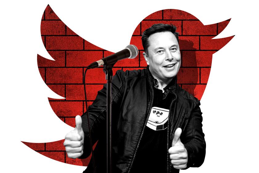
‘Like an alien’s version of comedy.’ ‘The sense of humor of a horny dentist.’ Nikki Glaser, Hari Kondabolu and other comedians on Elon Musk’s desperate quest to be funny.
“The letter X is a negation,” Bierut told me.
No kidding. To me, the negativity of the new brand exactly models the kind of spiteful interaction — bereft of humor, edged with despair — that good design should endeavor to discourage in social media.
Ever since Grasser, who co-founded the branding company Studio Mococo in 2016, posted about how he designed the bird, he’s been barraged with expressions of grief for the hopeful spirit his logo represented. I asked him why he thinks people are so moved by the bird’s retirement.
“It has so much to do with familiarity,” Grasser said. “It’s like when the tree on the corner goes down in the neighborhood. All of a sudden, you find yourself a little bit sad and you don’t know why.”
Virginia Heffernan is a regular contributor to Wired, the author of “Magic and Loss: The Internet as Art” and a podcast host. @page88
More to Read
A cure for the common opinion
Get thought-provoking perspectives with our weekly newsletter.
You may occasionally receive promotional content from the Los Angeles Times.
